
Great Rebranding Examples
What is rebranding?
Rebranding is the development or creation of a new corporate look and feels for an already established company. The most common goal of rebranding is to revitalise the brand and make it feel more modern and stay in touch with their customers.
This process can include the changing of a company’s logo, name, visuals, packaging, and any other touchpoints of the brand. Re-branding an existing company can be very challenging. But if done right can have major benefits towards the company’s future. Sometimes a complete re-brand is not always necessary. Instead, the company requires a brand re-fresh, which consists of subtle changes to your brand, such as colour palette or font. Let’s look at a few great rebranding examples.
Below, our graphic designer, Rob, has discussed some great, big rebrand examples.
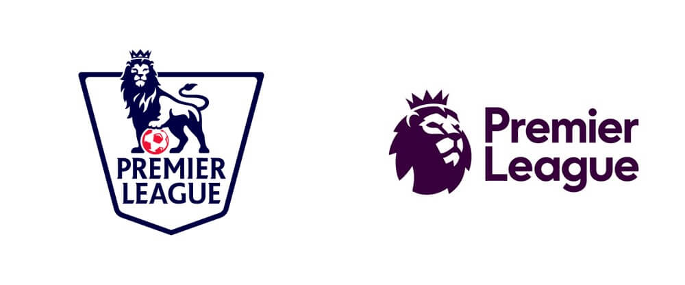
Premier League
Football is the most-watched sport in the world and within that sport. The Premier League is the most-watched league in football. With a potential TV audience of around 4.7 billion people, it is no small task to take on the brief of rebranding the Premier League. Ever since 2007, the Premier League was known as the Barclays Premier League, due to Barclays being the official sponsor. However, the Premier League decided to have no official sponsor to the start of the 2016/17 season. Therefore decided that a new look was needed.
The brief was to design a more modern and flexible visual identity. As well as change the opinions of the league. That at the time were positive about the game of football, but negative about the business. The touchpoints for the premier league logo are endless. It is featured on game tickets, as the app icon, on posters, uniforms, stadiums, etc. This was a huge challenge, to produce a design that not only would work to the size of an app, but also to the size of a stadium sign. And importantly, eye-catching and recognisable at just a glance.
“The new design system transformed Premier League into a vibrant, engaging brand experience across all channels; from broadcast and in-stadium graphics to corporate comms, international events, web and social content, and advertising. We helped Premier League manage this colossal rollout, working with their teams over an intense five-week period to reveal the new brand.” The final design for the Premier League rebranded by The Design Studio refreshed the image of the league in an attempt to create a new identity away from the previous sponsors.

attention to detail
Instead of scrapping the old logo completely, the decision was made to keep the main aspect of the old logo, which was the lion. But only focus on the lion’s head. This made it easier to focus on creating a simpler logo, as there were fewer elements to work with. The overall finished design resulted in a clean, modern, and adaptable logo, which matched the brief perfectly. They removed the serif font and replaced it with their own custom font. The issue with the original text was that the name Premier League was in all capitals, giving the impression of shouting. Now the text has been shifted to a lower-case lockup, which resembles more of the brand image that the premier league is after.
When presenting the logo, they were able to show how versatile the new logo really is. By showing how the structure can be changed to match any form of touchpoint. They included a range of club-neutral colours to launch the brand into their new season. But it is set to change in a three-year cycle.
Mastercard rebranding example
Rebranding a company carries a lot of pressure. Understanding that the logo you design will be seen by countless people worldwide. Mastercard is one of the most recognisable companies in the world and is responsible for the design of over two billion plastic cards. As well as their digital presence, printed collateral, such as billboards, and their headquarters. Re-designing Mastercard’s logo was no simple task.
When you think of interlocking red and yellow circles, your mind goes to Mastercard. The meaning behind the brand’s symbol is to show connectivity and seamlessness. Which is the key brand messages that Mastercard tries to portray. This style of logo has remained consistent since 1968, which makes it so recognisable to consumers, and therefore it was important to keep that consistency with the new logo. The reason for the change of logo was to bring their brand further into the digital age, which would result in their brand image being optimised for more on-screen usage.
Mastercard was able to accomplish this goal, by further simplifying their symbol. They removed the interlocking lines and replaced them by overlaying the two circles to form an orange shade in the middle. Also, for the first time in Mastercard’s logo history, dropped the brand name out of the circles. They paid homage to one of their earlier logos, by taking inspiration from their 1979 world mark. Which used a lot of circular aspects to form their new typeface Calle FFMark.
The response
After the rebrand, research showed that over 80% of consumers were still able to easily recognise Mastercard from just looking at the symbol itself without the inclusion of the name. The end result is a more versatile logo. That can be used at a much smaller scale while keeping the brand recognisable. The goal wasn’t to reinvent the wheel but to enhance it. A simple and effective rebranding example.
Co-op rebrand example
A lot of the time, the best way to achieve a successful rebrand is to stick to your history and return to your roots. In other words, sometimes you need to look backwards in order to move forwards. This is what the Co-op did when deciding to rebrand its corporate image. In 2007, the Co-op revealed their new logo, which was very different from any of their previous ones. For the first time since 1968, they moved away from their symbol of Co-op. Deciding to include their whole name, ‘The co-operative’. This logo lasted for nine years until they decided to re-brand their entire image, upon the release of a new membership scheme.
The benefit of re-using one of the previous logos is familiarity. They didn’t want their customers to see their new rebrand and not recognise the Co-op anymore. They wanted their customers to still feel comfortable coming in and not to feel alienated. Bringing back the Co-op symbol accomplished this goal. The only main aspect that they changed from their original 1968 logo, is making the light blue stand out more to give it some vibrance. As well as making the logo blue instead of having a rectangular border.
The rebrand response
The end result showed a versatile logo, that can adapt to any of the major collateral that the Co-op use, such as uniforms, bags, shop signs, and their packaging. The Co-op marked the occasion by stating ‘We’re proudly going back to ‘Being Co-op’. This message was distributed across a range of touch-points, such as a Youtube video, where they introduce their new logo to the public, showcasing how they have grown as a business, but stayed to their roots throughout.
Conclusion
All three of these rebrand examples are great because the companies outline and set their goals before they start the rebranding process. The main step to starting a rebrand is to figure out why you are rebranding and how it will benefit your company. This way you know what aspects of your brand you need to change to achieve your goals. However, before setting any goals, you always need to keep your customer in mind and ensure that any changes to the brand will benefit them. Looking at some successful rebranding examples might help spark some inspiration.
Are you looking to rebrand your business? Our graphic design team can help you reinvent and refresh your brand. Check out our branding page to find out more, or contact us to arrange a free consultation.