
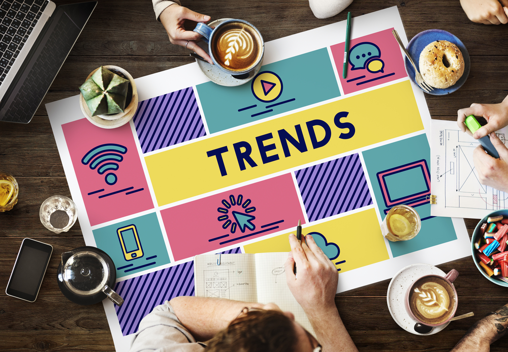
Web Design Trends – 10 to Watch for in 2018
A few clear web design trends are starting to emerge as the top dogs heading into 2018. Considering some more recent web designs, re-designs and or just tweaked designs, here’s a look at some of the fashions that will likely become popular for 2018. And why not look at our blog post on 2018 logo design trends for even more inspiration?
Asymmetrical Grids
The epoch of balanced symmetry is at an end. Split-screen models may have been trending last year. Innovators are dividing the visual elements on the screen with a more asymmetric grid, the evolution of the flawless half-and-half graphic outline.
For this idea to work, there has to be a distinguishing balance of topographies. So that no one side of a design is overwhelming the other. Space Text and components can be used to bring equilibrium. To visuals and draw the eye across the leitmotif.
The designs are still grid-based, which keeps everything structured.
Bright Colours
Bright colour seems to be the design trend that is staying put. This was a big part of Material Design and flat design. With equal importance, both ideas are still an integral part of many projects.
Even without many of the characteristics of Material or flat design techniques, eye-catching bold colours feel fresh and appeal to younger users as well as drawing users into a layout.
Bottom Sticky Elements
Making their way onto desktop and tablet designs. Are all those small advertisements at the bottom of applications and mobile sites. It’s not just adverts either, it’s pop-ups and chat boxes, notifications and navigational elements. Which are sticking to the bottom of the design.
Voice and Natural Language Search
Future web design won’t be 100% visual. Some of it will be audible, with interfaces that can hear commands, to integrating search phrases that imitate natural-sounding language, embracing the world of sound will be vital for future design developments as voice and natural language search is bound to increase in reputation. You should start preparing for it now, to incorporate it with ease into future projects. Why not let our specialist web design team help you prepare for the future?
Fluid Shapes
Sharp geometry and poly-shapes were a big thing in 2017, while softer lines, and a more fluid outlook and animations will gain popularity.
Smooth lines are an expected progression of the trend for polygons, similar characteristics hold for more liquefied shapes but the crucial difference, is that rather than distinct lines that intersect, every shape is made up of smooth, flowing curves consistent throughout the design.
Subtle Animation
Simple animation web designs often surprise and delight site users. They provide visual information and support the user through a more interactive engagement with a model. But an animation that is subtle can’t be about loading features that are janky, it has to be smooth movement integrated within the design.
From the coolest cinema graphs to hover states, to illustrations that appear to come to life, subtle animation or movement can be a great device for user engagement.
SVG Images
Scalable Vector Graphics trends are increasingly more common as a de facto type of image for sites. SVGs are lightweight vector images that make certain logos, icons and graphics, look pixel-perfect of screen size or resolution notwithstanding, with all high-resolution displays adding to the rise of this format.
In addition, SVGs work great with multimedia and still images, as well as 3D, animations for logos, cinema graphs, and 360 photography.
Split-Screen and Mobile Stacking
Split-screen web design trend patterns are popular and growing. These creative ideas are becoming popular because they provide consistent experiences on mobile devices as well as desktops. Often, early split-screen schemes were truly split, however trending for this year sees many designers opting for a split, with an additional layer of text or branding providing a result with more depth.
Scrolling Animations
Parallax scrolling animations were in danger of becoming passé making some designers shy away from them. But that just means you have to be more judicious with them, it doesn’t mean you have to bin them all together, there are a plethora of ways to incorporate scrolling to encourage user engagement.
Utilising White Space
Apple often utilises whitespace to focus attention on its beautiful products. And if the Apple brand stands for anything, it’s the significance of design in technology. Apple’s website validates that artfully. When you have merchandise as beautiful as Apple’s, you want the attention to focus on them. And that’s where the clever use of the whitespace around those products achieve that.
Playing with web design trends is really what it’s all about. Just ensure you use trends with care. As sometimes even the greatest ideas can quickly appear dated, while others can end up with a timeless finish; voice admixes are here to stay for a while, so try them out by making a change to an existing design and most of all experiment and have fun; that’s surely what it’s is all about.
If you would like to know more about the latest web design trends, speak to a member of the Castle team today.